The Art of Noir: Posters and Graphics from the Classic Film Noir Era
by Eddie Muller
(Click here for printer-friendly version)
This introduction was excerpted from Eddie Muller's "The Art of Noir: Posters and Graphics from the Classic Film Noir Era".
Published by Overlook Press
November 2002 $50.00 ($73.00 Canada)
10 1/4 x 14
256 pages
More than 300 full color illustrations
COMING IN NOVEMBER, 2002
INTRODUCTION
|
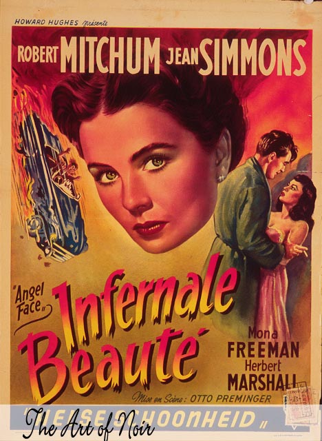
1. Angel
Face/Infernale Beaute A superb sample of Belgian art for the Otto Preminger-directed melodrama about a spoiled, murderous heiress. |
Maybe I should have called it *Gats and Gams.* A cursory shuffle through these pages will reveal a cavalcade of thrusting firearms and illicitly exposed legs. You'll see both on today's movie posters, of course, only without the shameless verve, the brash sensationalism, that makes vintage movie posters so alluring.
*Dangerous Desire* might have been equally appropriate. It speaks not only to the tension that drives the films, in which temptation and corruption form the core of nearly every plot, but equally to the marketing of these movies. What would Hollywood be without desire and greed? Every poster in this book flaunts luscious spoils; at the same time warning of the dangers awaiting anyone who tries to possess them.
Artistically, noir was a movement that washed over Hollywood like a black tide at the end of theSecond World War. It paired the deeply shadowed, expressionistic visions of expatriate European directors with the cynical, hardboiled school of American fiction. The result was a new cultural mythology, a black market that provided an alternative to the gleefully optimistic knickknacks Hollywood traditionally peddled, and poster art needed to be as alluring and dark as the product it was selling. The images of gaiety, affluence, and true love that had adorned studio-produced paper were transformed, in the years following the war, to depict the unrelenting hunger of desperate, distrustful combatants scratching for any advantage.
Interest in noir has risen steadily in recent years and has never been stronger. In the poster collectorąs market, itąs the segment that has seen the steepest rise in value. Dealers apply the label to any vintage film with cops and robbers, and its descendant, "neo-noir," to any contemporary art films featuring anti-social, well-armed protagonists. As a result, bidders at auctions have steadily inflated the value of posters for movies like *Blonde Ice* and *Repeat Performance*‹films that, almost certainly, the buyers have not seen and probably never will.
|
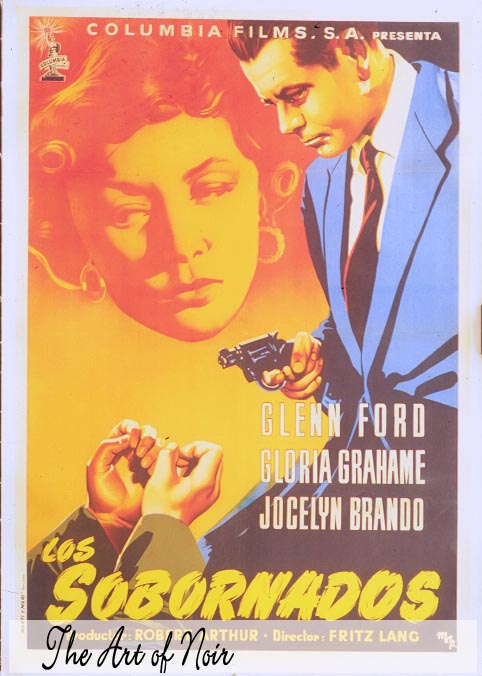
2. The Big Heat/Los Sobornados Spain
(1953, Columbia Pictures) This gripping example of MCP's "comic book" style mirrors the movie's brutal yet melancholy mood. |
What's the attraction? It must be the imagery, simultaneously innocent and incendiary, naive and nasty, featuring a blatant commingling of sex and violence that would fail to meet today's standard for political correctness. The irony, of course, is that, in the films themselves, no depiction of sex or bloodletting is too extreme for todayąs audiences‹but many of these fifty-year-old posters, for comparatively tame films, today would be rejected as inappropriate for mainstream advertisements
In the immediate aftermath of World War II, films began to reflect the stripping away of the cultureąs underlying innocence. Studio advertising had been previously aimed at females, but film noir wasmarketed to capture the growing audience of disillusioned, distrustful males, recently returned home from the war. The films frequently deal with alienated men on the fringe of a callous urban environment. The images on these posters capture this mood as vividly as the movies themselves.
The Hollywood posters included here also reveal a milestone in graphic design. As Americans grew more accustomed to photographic imagery in wartime newsreels, weekly magazines, and then television‹people gradually came to distrust the embellishments of illustrators. "Truth in advertising," came to mean photography. This was equally true in the entertainment industry. Painted pin-up girls were fine for fighter planes and calendars, but in the barracks, a photo of Rita Hayworth was worth ten Varga girls. It wasnąt long before moviegoers disdained painted images in favor of the "real thing." Illustration, as a selling tool, would soon be obsolete. Vintage posters would pass into antiquity, becoming the stuff of collectorsą dreams.
|
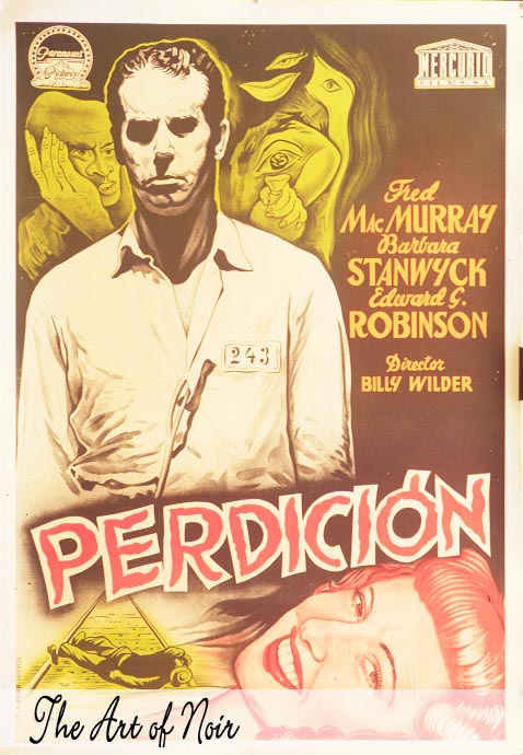
3. Double
Indemnity/ Perdicion Contrast the glamorous U.S. paper with this Spanish one-sheet, which peels back the glamorous facade to reveal the demons rolling beneath (including a guilt-shrouded image of Fred MacMurray not seen in the final cut. |
This book is a tribute to the craftspeople who worked diligently, quixotically, and mostly in anonymity, to bring a transient glimmer of artistry to a disposable culture, creating posters that, in some cases, have more lasting artistic value then the movies they promoted. None of them ever made their fortune from this work, which was destined for obsolescence at the end of a brief theatrical run. These artists always seemed to me like protagonists in a Cornell Woolrich novel‹fueled by grandiose dreams, but always battling against their imminent dismissal.
One of the undercurrents in noir is the individualąs struggle against, and eventual defeat by, the grinding gears of an omnipotent, faceless "organization." It is, of course, just such a bureaucracy that produces movie posters today‹a stultifying process of art by committee, the sole purpose of which is to achieve the marketerąs optimum combination of boldness and blandness. Itąs no wonder, really, that we've grown to treasure the uniqueness of vintage posters.
The films represented here were all produced in the United States, primarily between 1940 and 1960, though one of the book's themes is how artists of other countries depicted the peculiarly American phenomenon of noir. The artwork is also arranged to spotlight the cinematic contributions of essential, as well as some often overlooked writers, directors, and performers.
Posters were not chosen on the basis of their values to collectors. Some would pull a tidy sum at auction, I'm sure. Some probably can be picked up for twenty dollars. Selections were based on a poster's artistic and historic relevance. Taken together, they capture the spirit of noir, offer an overview of its development, and emphasize why the iconography is emblazoned on popular cultures worldwide. Iąve tried to maintain a balance between the informative and the aesthetic, to tell a story thatąs fast-paced and evocative, rich with intriguing characters, and spiced with liberal amounts of sex and violence.
I wonder where I got that idea...
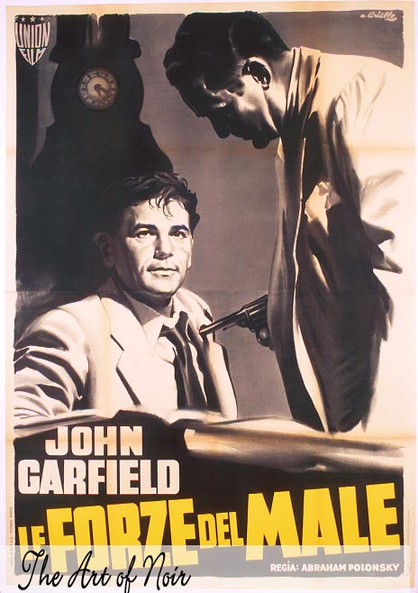
4. Force of Evil/Le
Forze del Male
Italy (1948, Enterprise - MGM)
55 x 78 in/ 140 x 200 cm
Illustration by Averado Ciriello
Courtesy of Tom Abrams
This Italian quatro captures star and theme with stark brilliance. An ambitious mob lawyer learns the perils of situational ethics when he tries to outsmart his bosses. Small man manipulated by omniscient masters, time running out. The essence of noir, captured.
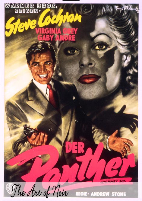
5. Highway 301/
Der Panther
Germany (1950, Warner Bros.)
23 x 33 in/ 59 x 84 cm
Illustration by Hans Otto Wendt (1957)
A poster pulsing with the dark thrill of the crime movies. Artist Hans Otto Wendt's rendering is the most maniacal ever of Steve Cochran, whose swarthy pre-Elvis sexuality added an erotic edge to the slew of gangster movies he made. The Germans clearly understood, retitling this film The Panther.
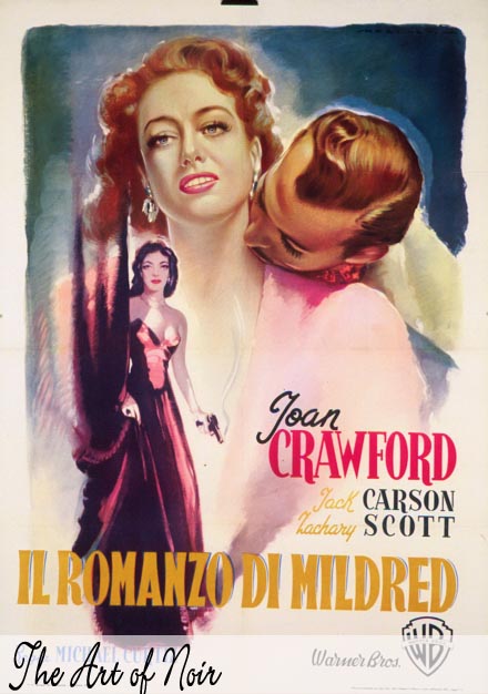
6.
Mildred Pierce
Italy (1945, Warner Bros.)
39 x 55 in/ 100 x 140 cm
Illustration by Luigi Martinalli
Courtesy of Matt Dorff
Crawford would have applauded this lushly erotic evocation of the Warner Bros. blockbuster that revitalized her career.
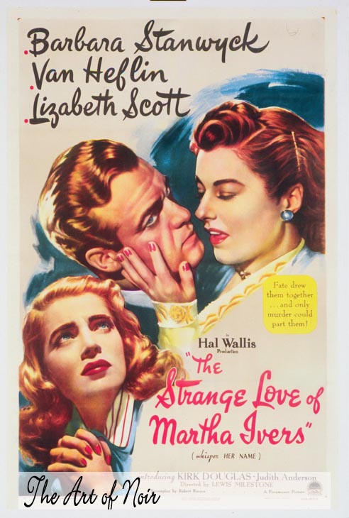
7. The Strange
Love of Martha Ivers
United States (1946, Paramount)
27 x 41 in/ 69 x 104 cm
An exquisite interpretation of the film's tone. the surface of a romantic "woman's picture", is darkened by an undercurrent of suspicion and perverse sexuality. While lithe legs and bounteous breasts were standard on American posters, Barbara's parted lips, and visible tongue were rarities for the period.
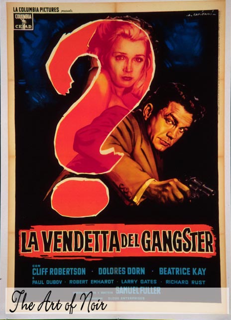
8. Underworld U.S.A.
Italy (1961, Columbia)
39 x 55 in/ 100 x 140 cm
Illustration by Alfredo Capitani
Courtesy of Tom Abrams
American posters sold this film as a documentary-style expose. The Italians - as they are wont to do, gorgeously played it as an enigmatic mix of revenge of romance.
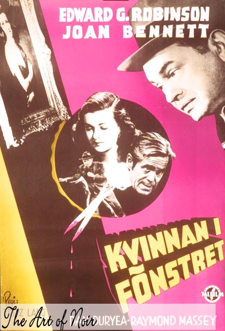
9. The Woman in
the Window/ Kvinnan I Fonstret
Sweden (1944, RKO Radio Pictures)
27 x 39 in/ 70 x 100 cm
Photo montage by Gosta Aberg
Dynamic photo montage was the specialty of Swedish artist Aberg, who created this undated poster for Fritz Lang's seminal 1944 noir.
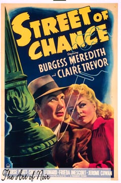
10. Street of Chance
United States (1942, Paramount)
27 x 41 in/ 69 x 104 cm
From the Cornell Woolrich novel The Black Curtain, this film was the first to capture the author's unique combo of spellbinding suspense and preposterous plot contrivance. So did the poster: the city askew, a pair of confused victims, a transparent dagger suggesting the amenesiac's nagging memories of a murder he may, or may not., have committed.